MOBILE APP
RESEARCH & REDESIGN
THE APA STORY
Austin Pets Alive is a non-profit no-kill shelter that has facilitated over 50,000 adoptions since opening its doors in 1997. APA worked for over a decade to get the city of Austin to pass a no-kill implementation plan. In 2010 they received a unanimous city council vote setting a save rate benchmark of 90%.
APA continues to step up by helping shelters nationwide implement their no-kill and training programs while also taking in displaced pets from natural disasters like Hurricane Harvey in 2017.
After speaking with APA staff members it is clear that they love what they do. However, they feel understaffed and overwhelmed by the influx of homeless pets day by day. Social media, events, free adoption days, a website and mobile app are some of the ways they are trying to solve this problem.
I've been inspired to help with APA’s efforts by offering to redesign their iOS mobile app. This will improve user retention, therefore, increase the adoption success rate. Everyone wins!
Role: UX Researcher, IA Designer, UX/UI Designer, Prototyper
Tool Kit: User Research, Interviews and Testing, Affinity Mapping, Figma, Sketch, InVision, Photoshop
PROBLEM
CONSEQUENCE
HYPOTHESIS
I believe a redesign based on user research will provide justifiable solutions to many of the pain points currently being experienced. I also believe that Austin Pets Alive will see an increase in pet adoption by simply providing detailed information for adoption, individual pet personalities, and statistics within the app.
PROCESS
I followed IDEO’s Human-Centered Design process and agile methodologies to make sure my design solutions were based on user research.
HEURISTIC EVALUATION
The first time I tapped through the APA app I was surprised to find so many usability issues. I was able to further inspect these issues by performing a heuristic evaluation. I use this method to make issues addressable and solvable as part of my iterative process.
WHAT ACTUAL USERS EXPERIENCED…
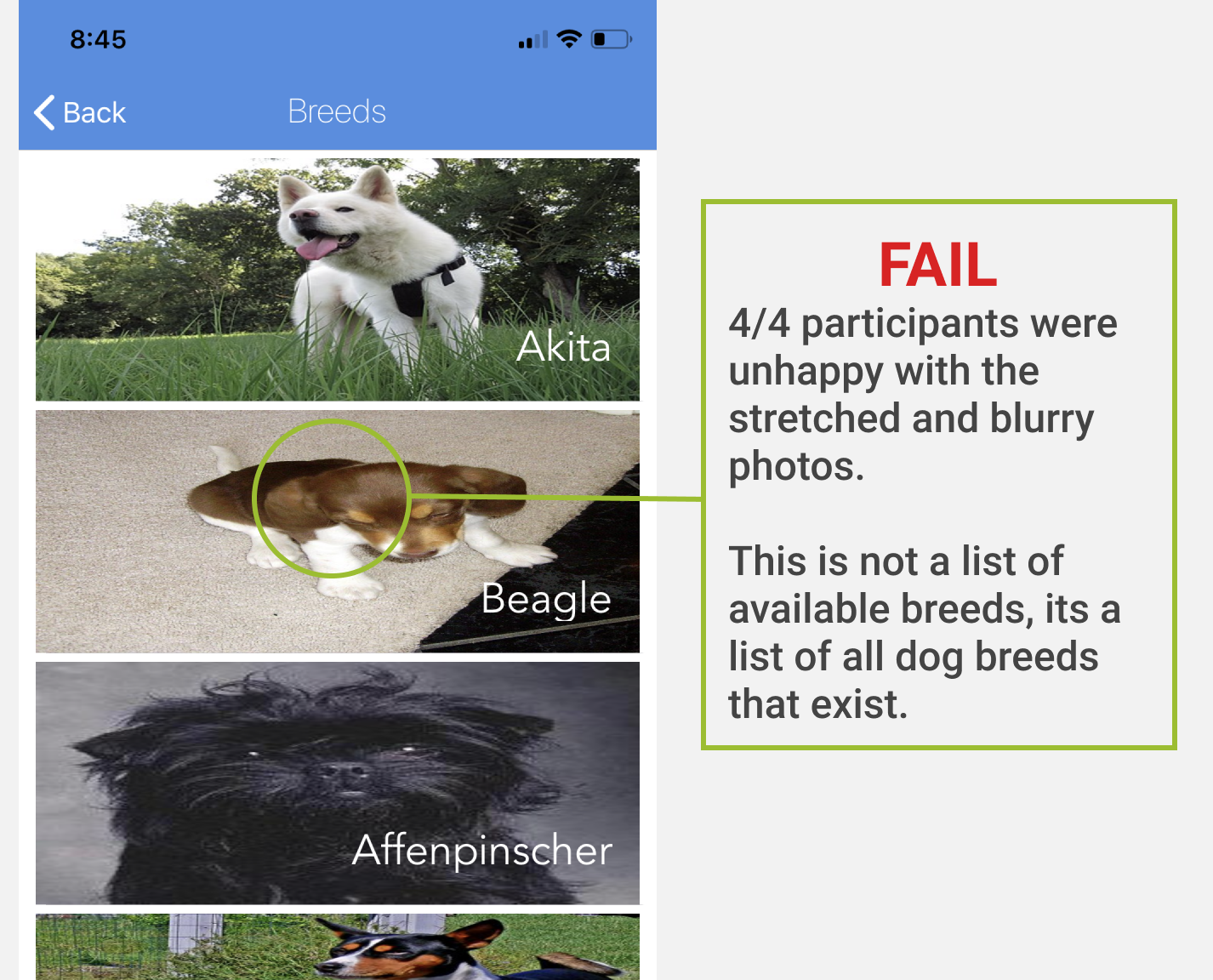
Valuable and consistent feedback was collected from 4 participants during testing. This was expected given the apps current lack of information and overall design. I didn't have to encourage anyone to think out loud. The app did that for me. It was like being in the passenger seat of your parents car while they rush through traffic, hitting all of the red lights trying to get you to school on time. Earmuffs, son.
Below you can see screen shots and usability findings of the current APA app.
IDENTIFYING & PRIORITISING
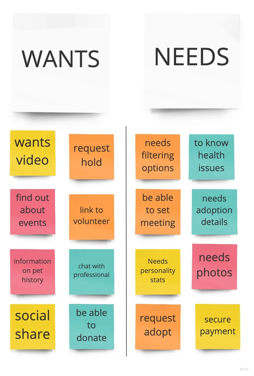
It was time to synthesize the data gathered from interviews and testing. I used affinity mapping to group the most common user statements and pain points. This allows me to better understand the needs and goals of the user.
PERSONA
"I am not my user"
That is my mantra throughout the entire research and design process. Personas and problem statements. They are my north star.
I created a persona based on overlapping pain points, wants, needs and goals synthesized from user interviews and testing. I chose to keep the profile simple. Just enough information to keep me in the fast lane as I continued to navigate this design sprint.
USER FLOW
To remain agile, I needed to create a simple user flow. I think of a task scenario based on insights from user research. This helps me when structuring information architecture and designing wireframes to meet the needs of my persona.
• Users want to see detailed information about a potential pet
• Users want to know what is included in the adoption
• Users want to see pets ready for adoption in their area
• Users want to be able to better filter their search for a future pet
INFORMATION ARCHITECTURE
ORGANIZED DESIGN
People use their smartphones while they are walking from point A to point B or while using public transportation. So, I take into account all the distractions users may be struggling with, including various viewing conditions, while using the app.
All of these differences require IA designers to rethink how the content should be presented in a mobile app to provide seamless UX.
IA EXPERIENCE
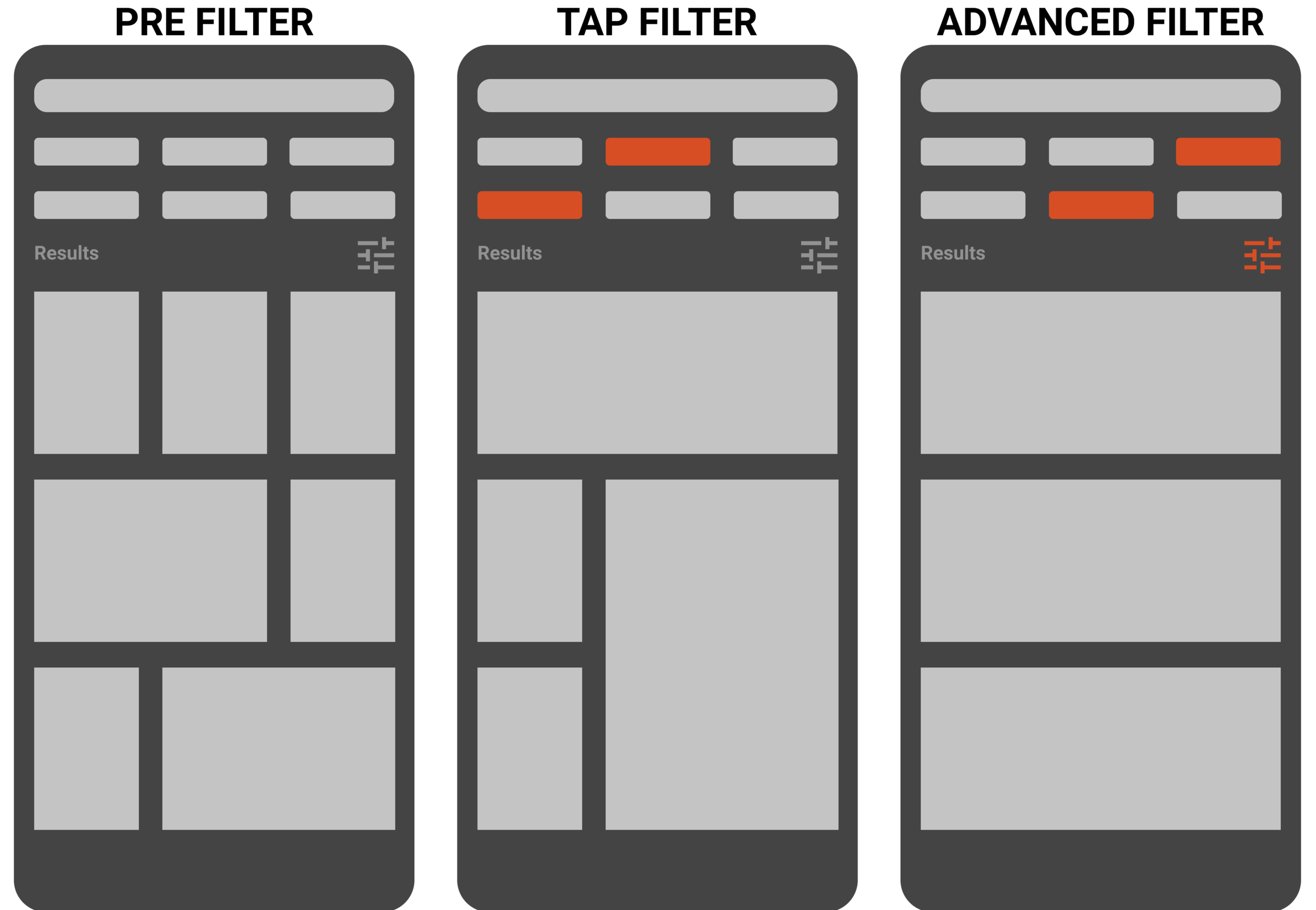
I chose to design for Filtered View as it allows users to switch between alternative views by filtering the content they are seeing. This pattern is great for giving users the freedom to choose how to explore the content themselves. Now the future pet owner can easily tap from small senior dogs to medium adults without having to leave the main screen.
Below you can see the process from wireframe to hi-fi mockup showing an example of the filter view UI experience.
BRANDING
The APA website uses a multitude of colors for its branding. None of which carry over to the app. I chose to minimize the brands color pallet creating what I felt to be a cohesive and updated take on what they already have set in place.
Next Steps
Once I present my research and design to the marketing and technology director at APA I will continue with research and usability testing to find the best design solution. It's been such a rewarding experience doing work that will help such passionate and selfless people and to know this will contribute to the number of furry friends saved each day.
Let's not say goodbye…see you next time!


